Research on some different type of magazines typography/fonts
- Jazib Ali

- Sep 23, 2022
- 4 min read
Welcome back my beautiful readers, today we are going to dig deep and discover the potential of typography. We are consuming different type of words in our surroundings . From a shop poster to a instruction booklet, there are fonts that works in building a powerful image for the brands. Usually, we witness the power that a font/typography have but we rarely realize that a great effort is done by the designer in designing that in a perfect form. So what really is typography? And why so much importance is given to it?
DEFINATION OF TYPOGRAPHY
According to the google, the typography is "the art or procedure of arranging type or processing data and printing from it". So that it look legible, clear, and visually appealing to the viewer. It is used to convey a message and appeal their emotions. Typography is what which gave life to the text.
In history, topography can be traced in as early as 11th century especially in book work, magazine, and public places writing. But after the innovation of internet and digital media, typography is present in both, digital and print media. After the innovation of digital technology such as software, the designer have access to a diverse range of font stored in their software and this make designing typography easy and accessible to everyone.
IMPORTANCE OF TYPOGRAPHY?
Typography is not about just choosing a beautiful font but it is most essential in designing a user interface. Some basics of it includes providing a graphic balance to the website, establish brand image, and toning the product. Typography is important in many different aspects which we will discuss in detail below.
Typography build brand recognition
A good typography not only enhances the personality of the website but also helps in recognition of the brand as the viewer starts associate that font style with brand. So this will help building a bigger user following as the font helps to recognize the product's brand. If the font is as relatable and premium as the product of the brand, the brand will be trusted by users in the future.
Typography influence decision making
Typography can put a special effect on the users as how they digest the message conveyed by the text. A eye-catching font style that is relatable to the product is way persuasive than a weak font which is not even related to the product. For premium perfume might used script typeface than a formal font.
Typography holds the attention of readers
Typography plays an important role on people viewing a certain website as if the text is visually attractive and memorable they might stay for an hour but if they are not impressed than they might move on to the next website in a minute or half.
ELEMENTS OF TYPOGRAPHY
FONTS AND TYPEFACES
Do not confuse type face with the font as both are different. Typeface (also known as font family) is the design of lettering that can include variations in size, weight, slope, width, and so on. On the other hand, font is a graphical representation of text character. In example shown below, Helvetica is font family (typeface) in which it have a sub category of Helvetica Regular (font).

There are mainly three types of typefaces: Serif, Sans-serif, and Decorative. To make the design neat and smooth, most of the designer prefer to use no more than three fonts and use the decorative font in a limit. Most designer tend to group Serif with the San-serif to create a effect by using one for the title and one for the body text.

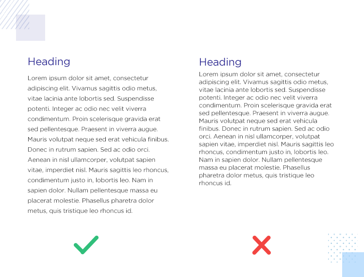
CONTRAST
Contrast helps on emphasizing a specific message or idea to the viewers. Most of designer pay attention to playing around with the typefaces, size, color, style, or character space so that it could me more impactful and easily readable.

From the above three contrast example, we could see that the editor changed the first to bold to create contrast. In the second the color is changed and the paragraphed have light opacity. The third one, he changed the typeface of the title and the paragraph color is dark to create a contrast. In my opinion, for printing work the third one is most suitable as a darker contrast can make a readable print.
CONSISTENCY
A typeface might be kept consistent to avoid a messy look or creating a difficulty for the readers to read. The message must be conveyed using the same font that are used earlier. For example, a font used for a title and another font for the sub category must be kept same throughout the design.
WHITE SPACES
It is the spaces around the text, also known as "Negative spaces". It is often referred to as areas with no text or graphics, and in form of margins and padding. This makes the design more readable.
ALIGNMENT
It is the process of unifying and composed text, graphics, and images to ensure there is equal size, space and distance between elements. Margins can be drawn to ensure this element.
COLOR
A color is the element which can make the text standout and convey the right message to the readers. The color have three main components, Value, Hue, and Saturation. A designer can master this to make a memorable design.
IMPORTANT NOTE
The findings are taken from the following YouTube video:


Comments