Preliminary Task
MAGAZINE COVER

VIEW MAGAZINE IN DIGITAL FORMAT
INSPIRATION
I took my cover magazine inspiration from the following "OUTBOUND" and "THE MONUMENTS OF SYRIA" magazines. These both have formal fonts with text colors that are in contrast and goes well with each other. So this make it a perfect example to take inspiration from. The overall framing and composition of the text is professional and eye catching for a magazine cover. The cover also make use of text behind the image which create a sense of imagery. The typography also used changing the size, character spaces, and fonts of the text to fit the needs of magazine cover.


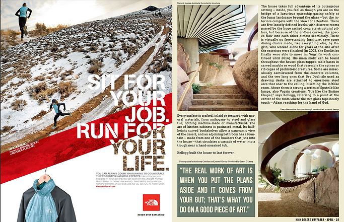
The feature article inspiration is taken from the article in the right side as it also displays a scene from travel magazine which is also showing locations and sites in there picture. So it is a ideal idea to be applied on my magazine as the genre and idea of my magazine is also common.
ROUGH SKETCH AND MOCKUP OF EACH PAGE

PHOTOGRAPHY OF MAGAZINE
Rejected ❌
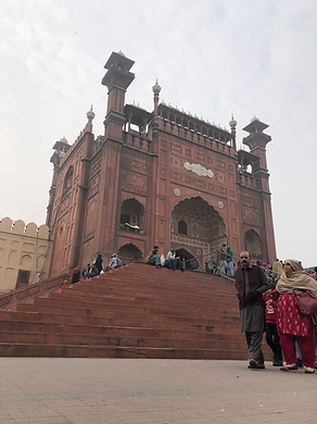
Accepted ✅
First photo is being rejected because it failed to apply rule of third and the perspective of low angle does focuses on the ground and the visitor in the picture but instead I need the monument of mosque to be the focus of image.


The first picture in this image have left out some part of the right side of the monument which the second picture fulfills so I picked that.

_HEIC.png)
DESIGNING

_HEIC.png)
This picture of the gate have a angle from the front and the picture fails to show the whole of gate which second picture has fulfilled and rule of third was effectively applied on second one.
The picture on the left is not picked because it fails to fill the frame well as it have unwanted floor and visitor are walking by the side. That is why second one was the suitable one.

DESIGNING
Table of content

Double spread

Double spread
COLOR CORRECTION


Photoshop CS6 Files Text files
BEHIND THE SCENES


REJECTED COVER DESIGN
Although the picture suits very well on the cover but I feel like the photograph was not in best composition, also I was unable to put the text behind the main image so this design was rejected. The picture was slightly blurred too.
EVALUATION OF DESIGN
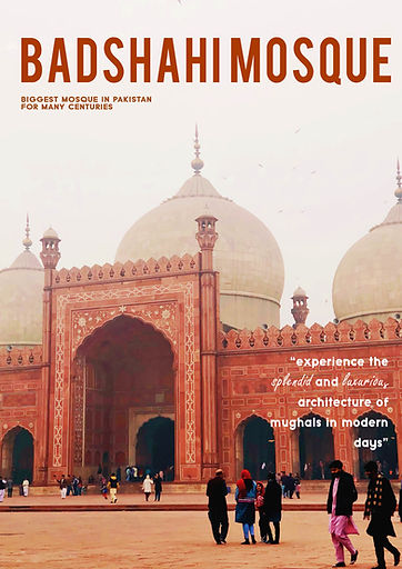
To start with, I picked out the picture for my magazine cover which was best in composition which was taken solely by me. I selected this picture for magazine cover because I can easily put text at the back of my image which gave a more professional look. The font used is "HenriDiot" which is a serif font and goes well in huge size especially for the masthead. The color of masthead text was taken from the main image because that would be more relevant and fits well on eyes of readers. I used the "Typo Grotesk" font for adding lead article line and supporting lines so I can gave a formal look to my cover. I added "Freestyle script" font to highlight some fancy words so that they might appeal to the viewer. Than finally added a barcode.
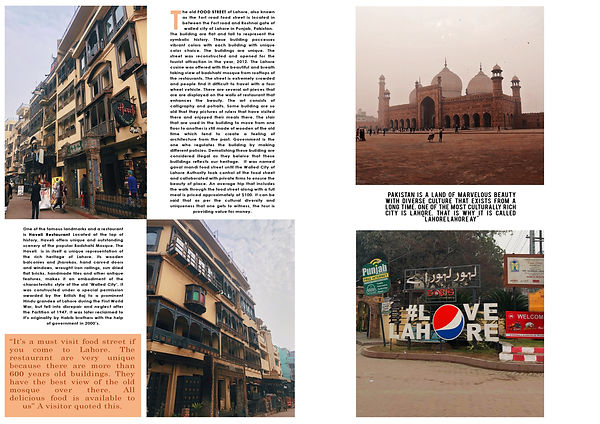
For my table of content, I picked a picture with contrast color such as light blue sky so that it will go well with black color of font. To highlight the numbers I added skin/light orange color in the background in circles. I used this color because all my photographs and masthead text color were relevant to this color and I wanted to continue the same idea throughout my magazine design. I also added the design on the top of table of content as that was similar to the next page. The design was taken from one of my pictures. I draw line to separate the title from the numbers.
Than on my next double spread I make use of guide lines so that my work look formal and professional. I put the three photographs in the first page and subtitle them with their names. The names have a background color of orange same as my previous page color. The font for is "Typo Grotesk" for subtitle and "Century Gothic" for the paragraph. I magnified the first word of letter of the paragraph and changed the color to orange so that the design look more realistic and more professional.
Moving to the last double spread, I carried forward the same idea by adding two pictures and adding paragraph opposite them. The positioning was already planned in the rough sketch. The first word of the letter was magnified here too. I also added separate paragraph which was little bigger than paragraph font size and added orange color in the background. So that the text could be highlighted more than the other paragraph.
The last page also known as "OUTRO" contains my final two favorite pictures as one is of "Badshahi Mosque" full fitted in frame. The other one contains a popular slogan said about Lahore city which says "Lahore is, Lahore" referring to it's uniqueness so best suited for my ending. I changed font of paragrapgh to "Bebas" font this was a bold style font so it can be easily readable by the viewers. I again used guide line by pressing "Ctrl+R" and positioned the picture accordingly. Lastly, in my opinion. the design I made was best looking as it focuses on architectural travel photography so a more formal look will be the most impactful.
LEARNING OUTCOME
There were several things that I learn from designing this magazine as it is my first complete magazine that is all designed and written by me. I have to research a lot of things before even beginning to draw my rough sketch. I was not familiar with the composition and making a creative layout so I watched the YouTube video "How to Get Better at Composition and Creative Layouts?".
I first time learned about the drop cap option in the InDesign which magnify the first character but I failed when applying on my work as I was using Photoshop CS6 and cannot identify any setting there so in solution, I changed the size of text and place them accordingly so that it look like I used the drop cap option. I used the technique of contrast which I learned from the video. It explains that you should leave spaces in the pictures and not make frame too busy by adding all the dense items and not adding any spaces.
The next thing I learned the hard way was that I was trying to learn InDesign software for working out my preliminary but failed miserly as I was familiar with the photoshop software settings so learning this was time consuming. But I still think that learning InDesign can make my work better and will be beneficial time investment for my final magazine work.
I also learned that there must be fluency in design of magazine so that reader must not be troubled when they reading any section of magazine. The idea of the design must be same. It was my first time so I tried experimenting with many fonts but I think using two fonts can be enough as you play around with font size and style. I also tried many color for masthead such as blue which I nearly selected it but at the end it does not giving fluency in the magazine so I selected orange which matches the warm color of the magazine photographs. These lessons will surely benefit in my next and final magazine project.