Post-production and Designing: FEATURE ARTICLE
- Jazib Ali

- Jan 30, 2023
- 3 min read
Updated: Mar 4, 2023
After content page, my second page consists of editor note, before other feature article pages. The editor note was also inspired by a design on the internet.
So I started by making an heading with "Poppin black" font. Than the subheading in "Poppin Extra Bold". The rest of text in "Poppin regular". The first word of the paragragh was magnified with the "Rockwell condensed" font. I used the pen tool to separate the space of the magnified word from the paragraph and wrote text in it. I put my name and signature at the bottom right corner. The name was written in "Poppin medium". I took my picture and aligned it with the quotation to make it lively in the picture.

Page number of articles are in "Monotype corsiva" font in faux italic because it looks relatively stylish in italic.
The page number three consists of heading of DM serif display. The second half of text is relatively magnified with the yellowish / mustard color picked out from a droppers tool.


Than in paragraph, I used pen tool to make an empty box in the middle of the page and also separate the magnified character at the start of paragraph. The font for paragraph was in "Poppin regular" and the font in the middle box was in "Poppin medium". I used extra bold for the text in paragraph to highlight the main story of the whole page. The pictures were aligned above so that the negative spaces of borders could be highlighted.
Page number four consist of a full frame picture.
Page number five also consists of a full frame picture with text on the top and bottom right corners. The quotation was in "Lato semi bold" font with an italic faux. In the conceptual picture, I took two pictures and by using selective tool, I separate the kid in the mirror and infront of the mirror. Than by using mask tool, I changed the background of the picture into black and white, so that reader can focus on the main idea.
Page number six also follow the same of idea of putting the two picture at top side of page. The paragraphs were aligned in three equal paragraphs boxes. Than the flush right and flush left paragraphs with stroke of blue and greenish colors. Beside the paragraph, is a circular shaped picture with it the subtitle. The design of the subtitle was randomly inspired by a picture I saw on social media.
For creating that design, I used polygonal lasso tool to shape it by merging points of excess area and than clicking the delete button. The text in the subtitle is in "Poppin medium" font. The yellowish color of text was the same as used before for the subtitle text and the first magnified character of the starting paragraph.
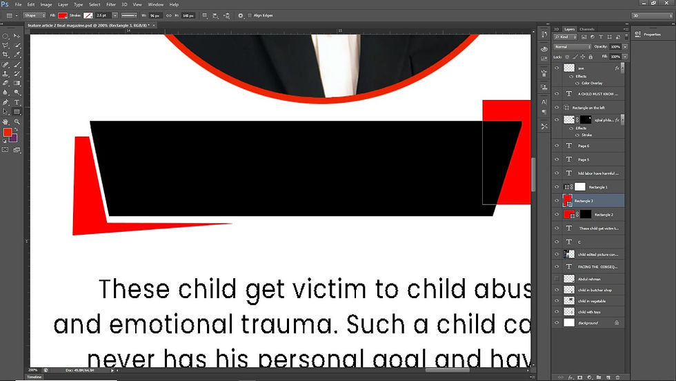
Page number seven consist of a black and white design which was inspired an internet picture.

The page starts with the heading of "DM serif display" font with half yellowish color. Than a subheading on the right side. Rest of the paragraphs and descriptions are in "Poppin regular" font. The first paragraph was aligned using pen tool so that the picture of the kid in cycle can be involved in the paragraph. The black line was drawn to separate the paragraphs. I also edited one picture full of tools in my mobile app known as picsart as that was fast and convenient. Moving to the black section of the page, It contained three paragraphs, each with a picture at the side of it.
BTS OF TOOLS PICTURE:


Page number eight contained a full frame picture with a quotation with "Lato semibold" font. Which was naturally aligned with the slide of the picture.
ALL THE PHOTOSHOP FILES:
ALL THE FONTS USED:
Note: Some of the fonts like "Monotype corsiva" and "Rockway Condensed" are originally installed in Photoshop CS6 version, so it is recommended to open the photoshop files in this version only.
REJECTED FEATURE ARTICLE DESIGNS

The following page was rejected the looks not aligned according to the composition and it was difficult to proceed further in design from this point of the picture.

I tried to make a character at bigger text and align the the paragraph according to the character's shape but soon I realised it might make the design complex and untidy.


These designs were rejected because the composition of all the elements was not right. The root thought of making the use of the pictures to separate the paragraphs was defaulted as it turns out to be very untidy.


Comments